Micro website for Mohawk
Client: Mohawk
Advisor: Sean Adams
Team: Na Yeon Kim, Lavinia Lascaris,
Masha Rassam, Heejeong Seong,
Yijia Tang, Luxi Dai
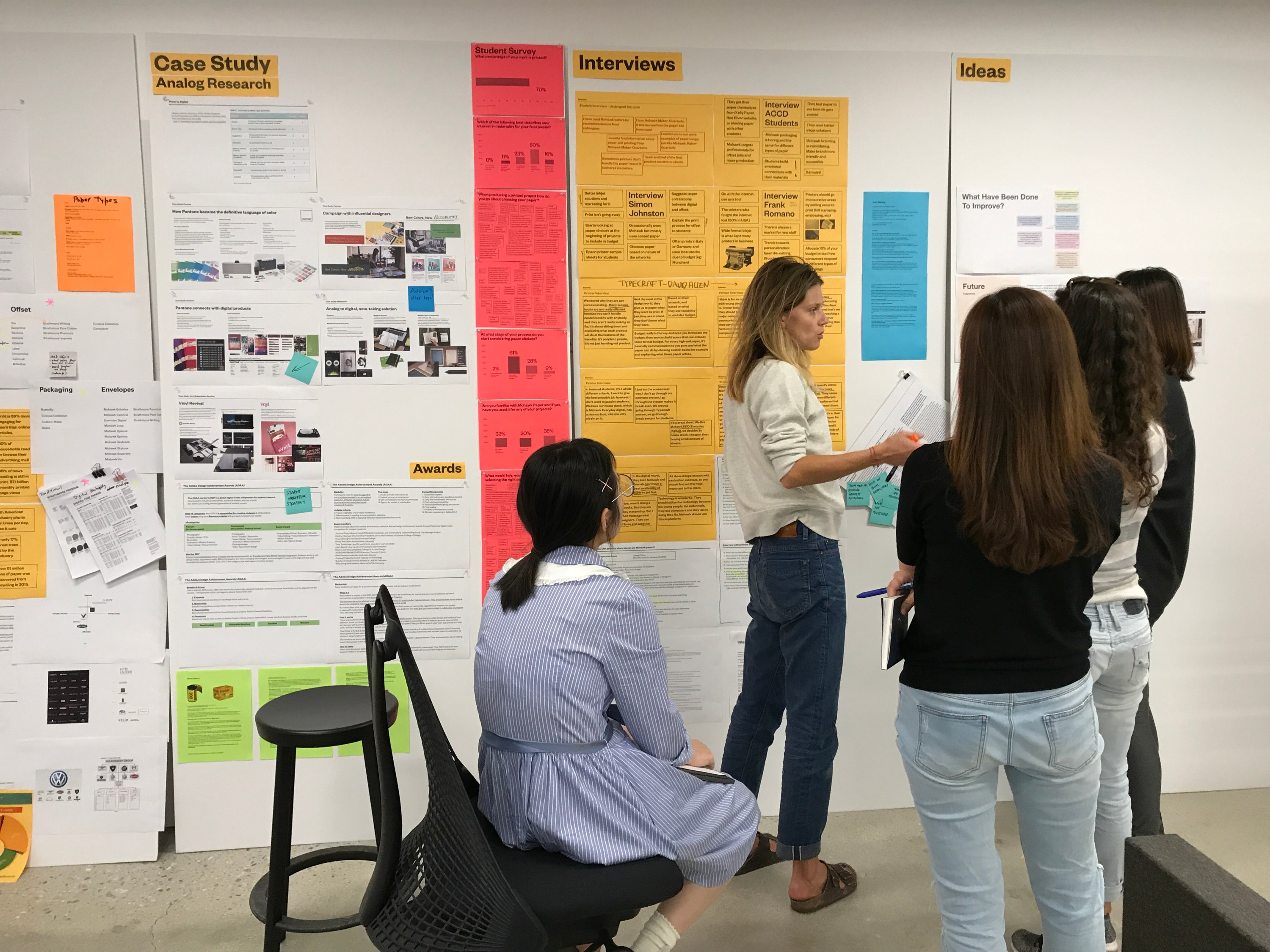
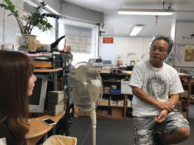
The fine paper company, “Mohawk” asked our team to solve their current problems. After deeply researching about it and interviewing lots of people like designers, students, and printers, we made a new strategy and then individually took each part. I made a micro website, especially for students and young designers.
Problems
Printing is an option now.
The design community has diversified.
Young designers are not well-educated about paper.
Designers are at the mercy of printers when looking at paper choices.
Questions How do we elevate the role of materials in print?
How can Mohawk build a relationship with students?
How can Mohawk bridge the gap between designers and printers?
How can Mohawk educate designers to choose well-suited materials early in their design process?
Target audience
Questions How do we elevate the role of materials in print?
How can Mohawk build a relationship with students?
How can Mohawk bridge the gap between designers and printers?
How can Mohawk educate designers to choose well-suited materials early in their design process?
Target audience

Help communication between printers and young designers who will be potential clients in the coming future.


What we found from research and interviews Mohawk branding is “trying too hard.”
Not easy access to Mohawk.
Complicated website to search paper and navigate.
Need more samples! in class.
Not enough education about paper.
Only 1/3 of students have used Mohawk paper.
70% of students work is printed.
70% of students would spend 20% more money for premium quality paper.
60% students feel confused and intimidated when they select the right paper.
Students perceive Mohawk as…very clean and luxurious brand and mostly for professionals.
Unclench!!!
Break the old brand image of Mohawk to attract the future loyal customers (students and young designers).

New strategy
1. Educate about paper
2. Easier access to paper
3. Simplify the lines
4. Create cultural aspect
1. Educate about paper
2. Easier access to paper
3. Simplify the lines
4. Create cultural aspect
Simplify website